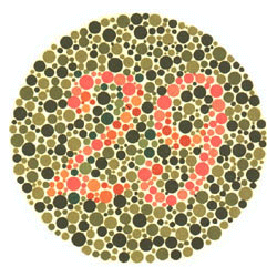
Accessibility: Designing for the Colorblind
As designers we are often focused on what colors to use, which type looks best, and what graphics pop and fit well with our message. And yes, we are also thinking about the users’ experience - “Does the user realize that the link was clicked/tapped?” for example. We are usually thinking about the 91.5% that can see normally. So what about the other 8.5% (8% male vs 0.5% female) who are colorblind? There are currently about 3.5 billion people who roam around using their mobile devices to communicate, socialize, travel, shop -- even learn -- and that means approximately 41 million people may not be able use your application to it’s full capability if they can’t see it correctly.
So what’s the biggest challenge?
As designers, our biggest challenge is not knowing how to determine if a user is colorblind or not.
How can we keep those in the 8.5% in mind when we design?
We know it’s not always possible, based on client preferences, but we should keep our color selections in mind. Using dark colors with dark interactions (such as color transitions when tapping or clicking) could cause some confusion or illegible content. So we need to make sure there’s a significant change when we design something to change upon interaction. A couple other options would be to use high contrasting colors, textures, symbols, or thick lines in our designs. One really good example of those would be when creating a key or legend. Trying to avoid combinations like green/red, green/brown, blue/purple/, green/blue, light green/yellow, blue/grey, and green/black are important.

So why is all this important?
Mobile devices -- especially handsets and smaller tablets -- amplify all of these issues given the reduced amount of screen real estate our audience have available to them. And don’t forget older eyes will likely have more issues handling the minutia and nuances of the various mobile interfaces and content items your audience is consuming. Indeed, designs should strive to be user-friendly for your entire target audience while adhering to the standards and best practices that ensure accessibility.
A few helpful apps to know your design is working for everyone.
- ColorOracle
- colororacle.org
- available for mac, windows, and linux
- free
- Colorfilter
- http://colorfilter.wickline.org/
- for looking at webpages
- free
Ishihara - English version from Yoav Brill on Vimeo.